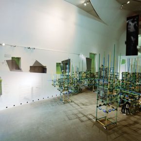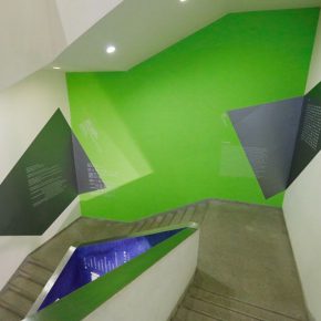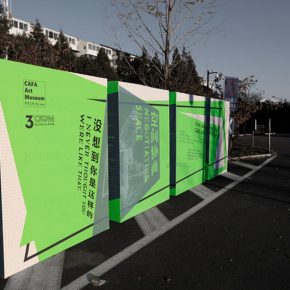
The CAFAM Biennial “Negotiating Space: I Never Thought You Were Like That” has been on show for a while, the novel and avant-garde concept, experimental explorative process, the exhibition breaking limitations have all attracted a wide range of discussions inside and outside the art circles. Many journalists record that it is like “the growing of iron and steel”, “l(fā)ike the woods”, “meandering like twists and turns in a white space” to describe the grand site of the exhibition, once the viewer first steps into the exhibition space, he will be attracted by the green-based giant installation, supplemented by the yellow and blue colors – the “scaffolding” that implicates the infinite extension and the unrestricted growth, is undoubtedly the purest and the most flexible design expression showing the “negotiating” theme.
The design of the exhibition is conceived and created to present the concept of the exhibition, and good design can enhance the visual communication of ideas. Now we will probe into the visual system of the CAFAM Biennale – including the conceptual design, generating system, presentation effect of the small-scale invitations, posters, books and graphic design, the large-scale “negotiating wall”, display window and “scaffolding” one by one.
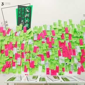
Jumble of Growth in the Negotiating SpaceThe design classification of the exhibition consists of two parts, including the visual communication and spatial presentation, which complement each other and echo each other, directly revealing the idea of the exhibition. “Visual design has always been around the exhibition’s essential concept of ‘negotiation’ to generate.”
The basic form of “scaffolding” has become the most reasonable basic spatial element, it is not only a metaphor of the concept of “spatial growth”, the flexible form well coordinates the main exhibition space of the art museum, the building of a negotiating atmosphere becomes lively and interesting, the forest-like “organic organization” also gives the audience the possibility of thinking, which is precisely the visual expression trying to get rid of a single restriction, to create a democratic negotiation process. At the same time, it is different from the natural growth of a forest as the growth of scaffolding with the modular superposition in the background of industrial age, seems to be the metaphor for urban life that is gradually far away from the nature.
The shape of the scaffold is not only the visual transmitting of the concept of the exhibition, and its design function can’t be ignored either. The enlarged two-dimensional codes, which contain the artists and the works of art, and the videos recording the negotiating process are set in the “jungle”, they seem to be modernized fruits of the iron trees, and are alternately arranged to form a hidden line leading the audience to shuttle in the jungle.
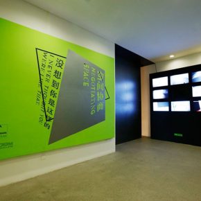
The Negotiating Green for Free BreathingThe choice of color, green is taken as the main color of this exhibition, it is the most common color in nature, and it can be said to be the closest to the key word of growth, in the theory of five elements in China, “green” is the symbol of “wood”, which coincides with the concept of jungle for scaffolding. The design team also names it “negotiating green”, taking it as the basic tone, while decomposing it into the “yellow” and “blue” colors, together with the negotiating design frame in gray which has a similar brightness.
Seen from the actual physical field, in the theme of this Biennial “Negotiating Space”, the space is divided into the display space of artworks and exhibition space of the located building. In addition to the scaffolding located in the entrance to the museum and the lobby, the irregular color blocks are particularly eye-catching. The color blocks take the most agile quadrilateral as the basic shape, this can then be freely stretched, being active and unbounded is the biggest feature of the shape, while the fragmented images are scattered among the huge leaves of the lobby in the art museum, uncovering the giant leaves, breathing with a flexible, free attitude in the active space.
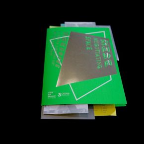
Continuing the “Negotiating” DesignThe CAFAM Biennale has issued about 1,500 invitations, which use the basic model of envelopes packaging letters, and the envelope is designed from a very thin vegetable parchment.
The main body of the invitation is the most special design – the form of “negotiation” was creatively and artistically reconstructed, using superimposing different letter papers to present the state of “positive negotiation”, when the invited people receive invitations, it is as if they join a negotiation, and the stack of papers in the hands is the relevant data of the event, the paper of different colors are printed with the itinerary of the “meeting”.
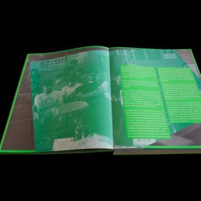
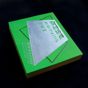
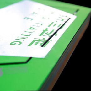
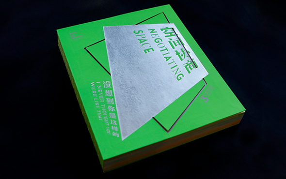
The book of the Biennial uses the technique of hollowing the cover, over locking the edge with green lines, and it is the first time for the design team to attempt to use the technique of hollowing in the book design of the art museum’s exhibition. The internal design of the book continues to use the flexible main visual graphics to transform, and it is worth mentioning that the pattern of each page of contents is not a quantitative copy, and the dark fringes of the underlying graphs are all from the processed manuscripts and the finished products. In the aspect of font selection, the Chinese and English title of the “Negotiating Space” uses the combination of Times New Roman and Blackbody – interweaving the discordant voices and the collision of different views is revealed by the combination of two relatively contradictory fonts.
The high-quality optical system makes the exhibition achieve the best effect, for this CAFAM Biennial, the “negotiating” concept differentiating single negotiation rights and breaking the control of pattern is embodied in the visual system, whether it is from small visual graphic design (for example: a combination of fonts) or the large arrangement of the space, the keywords of breaking the normality, full of fresh ideas, challenging the unknown are cleverly implied, the work of design can speak for itself. After prying into the design stories, I find the exhibition subtitle becomes the most appropriate sign, “negotiating” design – “I Never Thought You Were Like That”!
Text by Zhang Yizhi, translated by Chen Peihua and edited by Sue/CAFA ART INFO
Photo by Wang Yuqi/CAFA ART INFO